Finished A2 Poster!

Screen Shot 2016-01-12 at 21.53.53

So here it is, my final poster design. I am very happy with the way it has turned out, it has developed a lot from my initial ideas. I think that it is quite a simplistic design yet it works well and gives across the data well, there isn’t anything I think I would change if I had to re-do the poster.

Final Poster Teaking


Screen Shot 2016-01-12 at 20.24.08 

For the final touches on my poster I tried to add the perspective to the wavelengths, I managed to successfully get them to all go in the same perspective, but I found that it left a lot of space when it was in perspective. It was so squashed that I thought might fit if i switched the poster to portrait, which ended up working and looking a lot better. The final step was to fill up the blank space at the top so I added a title so that people looking at the poster would know what it is showing.

Screen Shot 2016-01-12 at 21.31.41


Finished Wavelengths

I made all of the wavelengths for each of the genres, keeping them accurate to the genre they are representing and to the popularity of the genre at that time during the 20th century. It took a very long time as I had to do each line with the pen tool, however I am very happy with the result as they look a lot like wavelengths from songs which was the original intention. The only downside is that i focused a little more on the design side and it is a little unclear on the exact popularity of the genres at points so i added a slightly translucent line to help highlight the popularity.

Screen Shot 2016-01-12 at 14.45.56            Screen Shot 2016-01-12 at 19.33.25

Creating the Representative Wavelengths

Screen Shot 2016-01-11 at 19.43.26

The next step of the design process was to combine the research I’d found about the popularity of the genres over the 20th century with the wavelength designs I had made to make the representative wavelengths for each genre. I drew out a rough draft of how each of the timelines would look on paper first, using the sites I had used before https://music-timeline.appspot.com/#s%3Apop and a new site https://en.wikipedia.org/wiki/20th-century_music to help map out the spikes and declines in popularity for each genre. I then recreated the rough paper ones whilst trying to stay as true as i could to the representative designs as i could to make it look like the wavelength of the music genre.


First Steps

The first step for the poster was to create the basic timeline template so that I can add in the wavelengths in an evenly spaced and presentable manner so that it is easy to see the data for the viewer. I will create the perspective once I have done the wavelengths as it would be a lot harder to create them when the timeline is already in the perspective and it would be more difficult to show the difference in popularity.

Screen Shot 2016-01-12 at 14.45.56

Accurate Wavelength Designs

I wanted to get accurate designs for the wavelength of each genre so that they are more easily distinguishable and can represent the genre on the poster. Hopefully each wavelength will make it easier for the person looking at the poster to see the genre it represents. Even though i will have the names for each genre on the poster it will be good to see how the genres differ and how some of them are similar in wavelength.

Print       Print

Having made the template design for each different wavelength with the line tool in illustrator, I am very happy with the result and although it took quite a while to make each one i think that it will look really good with the finished product of the poster.

Researching The Popularity of The Genres Over The 20th Century

To find out the popularity of each genre over the course of the 20th century i had to look at a lot of different sites so that i could get an accurate idea of the popularity of the different genres to represent on the timeline. Using the sites like https://music-timeline.appspot.com/# which had a timeline of its own and other sites that were more text based like http://www.oxfordmusiconline.com/public/page/twentiethcenturytimeline i could get a grasp of how to present the genres in my poster. I found that genres like classical didn’t just start to die out when the other genres were invented, obviously it went down in popularity but it didn’t die out completely. I found with other genres there were massive spoken in popularity a few years after they were invented, especially with Hip Hop and Rock.

Screen Shot 2016-01-11 at 19.43.26

Starting the Final Design

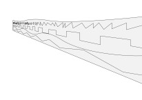
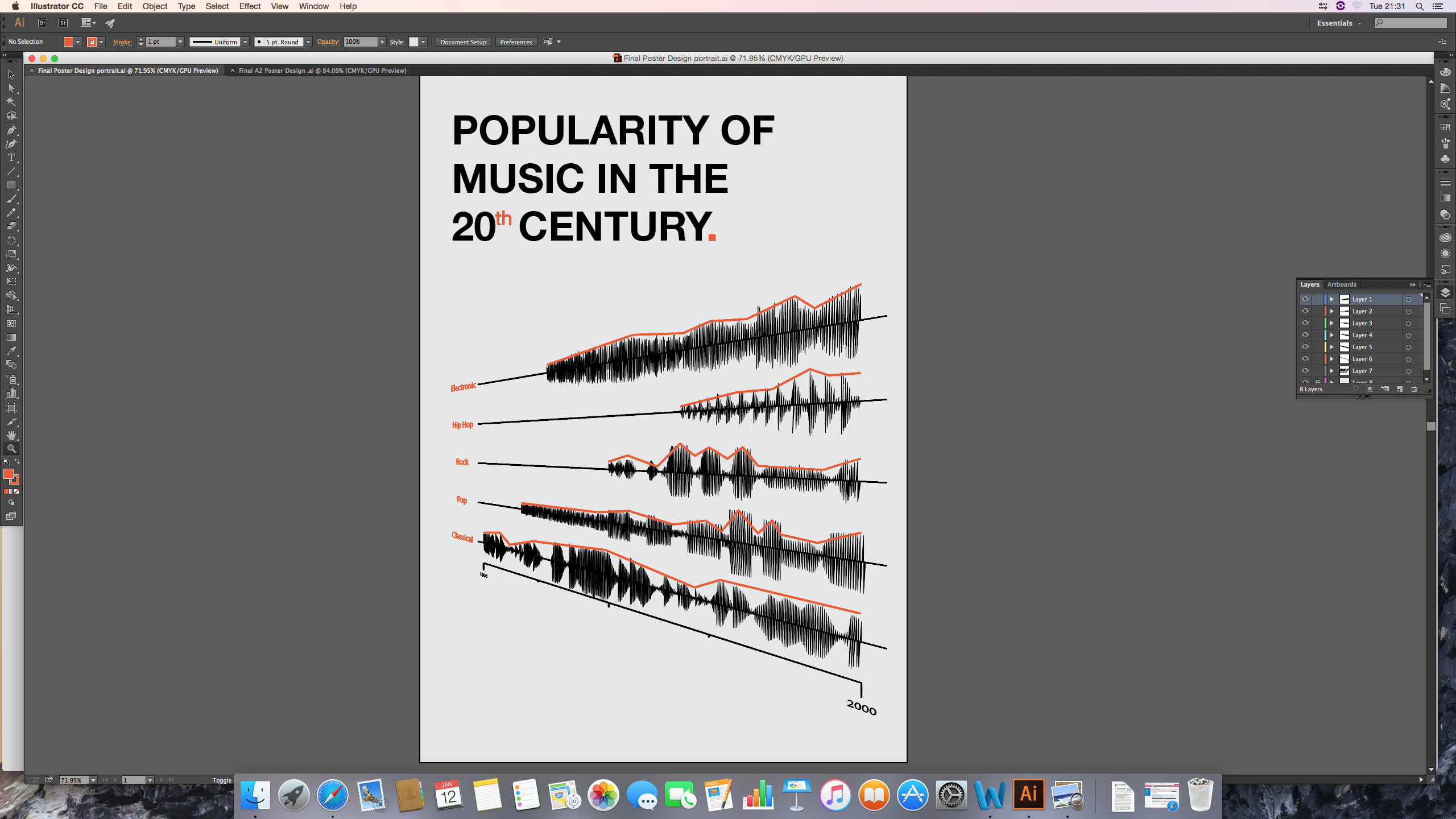
After going through all my drafts, I decided on my favourite design and started coming up with ideas on how I could develop it. The design i chose was the first perspective design as it was simple yet it had the concept of the macro overview and the micro detail a lot more that the other designs. The wall idea was what i played on with the developments and I made two more rough designs to encompass this, one with a person viewing the timeline like it was a wall and another like it was a painting.

rough design 3   Design Development 1   Design development 2

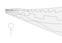
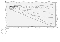
The developments looked alright as ideas but they didn’t really work with the idea of simplicity as well as the first idea so i decided to keep it as just a wall, and have the person who is looking at the poster be the person viewing the wall. I will just need to make sure the design takes up the space of the poster.

Poster Draft

rough design 4This next design i tried to keep with the perspective but to show off where the different genres would start on the timeline as they were all invented in different times. This design was definitely not as strong as the other perspective design as there was not much sense of continuity as it had the lines starting halfway through the timeline. I decided that the line for the genre would have to start at the beginning as just a straight line until it was actually invented, this would create a lot more continuity in the line.

Poster Draft

For the next draft I decided to try using perspective to give it a  3D look without having to make each individual wavelength 3D. I think that the perspective worked a lot better than making them each 3D individually as it worked a lot with the idea of the design being seen with a macro overview and the micro detail as you can see the wavelengths on the timeline as the micro detail and an essential ‘Wall of Sound’ in the way the perspective makes the wavelengths look like a wall.

rough design 3